
Granular Diversification Diagram is an interactive visual network diagram that shows the correlations between pairs of individual securities in the portfolio.
On the diagram, the nodes represent the individual investments, while the lines show the correlations between those investments. The matrix is a tabular representation of the Granular Diversification Diagram, however it is not interactive.
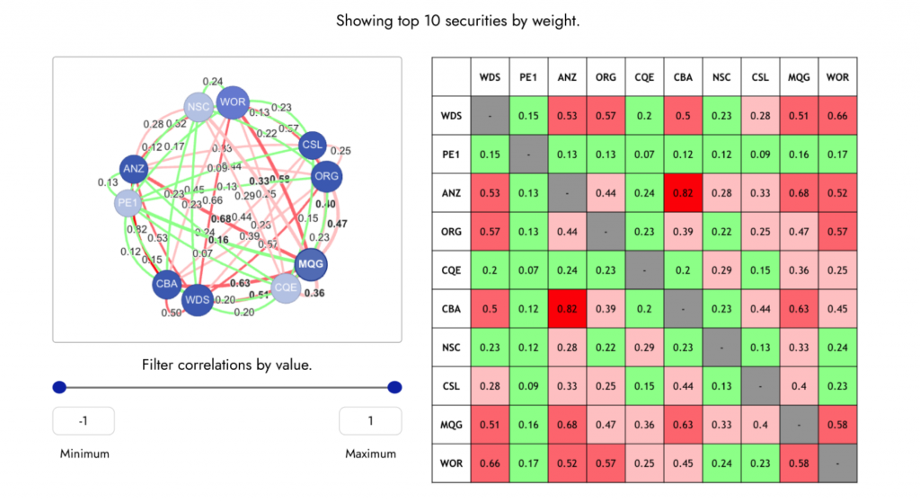
The nodes and the lines are colour coded: for nodes (investments) the colours are based on the size (market cap) of the investment, and for lines, the colours are based on the strength of the correlations between two individual investments. You can find the legend explaining the colours underneath the matrix.
For large portfolios you can use the filters on the left to filter out some of the correlations and focus on what’s of interest to you.
Ready to learn more about your portfolio’s granular diversification and correlation? Log in or sign up to your account today to start analysing and optimising your investment portfolio.